UX Design & business analysis
Wellvia is an online healthcare platform that provides convenient, asynchronous care for common acute conditions through a symptom-driven questionnaire and clinician review. Its primary goal is to offer affordable, accessible, and efficient treatment without requiring an in-person visit, improving patient outcomes while reducing the burden on traditional healthcare systems.
To treat cases, clinicians work entirely out of one app, called the Provider app, in a case list queue called "Eligible". It's called "Eligible" because it populated with cases that a Provider was eligible to treat based on state and insurance licensures. If a case is treated, it’s billed to the consumer and becomes a revenue-generating event.
*Name changed and product white-labeled for client confidentiality.
Wellvia's hope was that, by improving the Provider app experience, clinicians might be more efficient and be able to tackle more events per hour. An increase in events per hour would translate to an increase in treated cases (revenue-generating events) per hour.
The company's efficiency goal for the year was 5.5 events per hour and 4.5 treated cases per hour.

Question to be answered
Twelve clinicians plus clinician leaders come together in-person in a focus group to discuss one pressing topic and ideate ways to solve the problems they're experiencing.


To treat cases, clinicians work entirely out of a case list queue in the Provider app. If a case is treated, it’s billed to the consumer and becomes a revenue-generating event.
Since Wellvia had been established, case volume had grown tremendously. Hundreds of cases per day were populating into the queue, to the point that there could be more cases in the queue at the end of the day than when a shift started! Clinicians were facing burnout and frustration, which threatened both efficiency and morale.


As a clinician experience business analyst, I worked closely with a product owner, UX/UI designer, and senior engineers. I facilitated collaboration, synthesized user insights, and drove prioritization based on technical feasibility, business value, and user needs—all under a tight pre-busy-season deadline.
This solution was to be launched by October 31, the beginning of peak flu season. Busy season was a make-or-break time of year for Wellvia's financials: This was when the company’s profitability moved into the black. We could not risk having technical outages and missing out on case volume during this time.

Goal: Efficiently and compassionately treat patients while feeling a sense of progress, focus, and accomplishment at the end of each shift. They want to maintain high-quality care, meet business targets (like EPH and treated cases per hour), and feel like they’re making a meaningful difference without burning out from repetitive tasks.
Pain points
Motivators

Goal: Empower clinicians to treat cases efficiently and confidently, ensuring a positive and productive experience while consistently meeting Wellvia's business targets—even during peak demand periods.
Pain points
Motivators
Our focus groups consisted of 2 in-person sessions, 1 virtual session, plus a digital Miro board to capture those who watched the virtual session recording.
Our activities aimed to elicit direct feedback in relation to their working day and work in the queue. There was an empathy map to understand the influences and environments in a shift that have an impact on how clinicians think, feel, and do their work; and a “pains & gains” brainstorm activity on ways that the queue currently makes work feel harder and, therefore, could be smoother.
At the end of each session, we grouped stickies by themes and had clinicians vote on their most-desired topics and features.

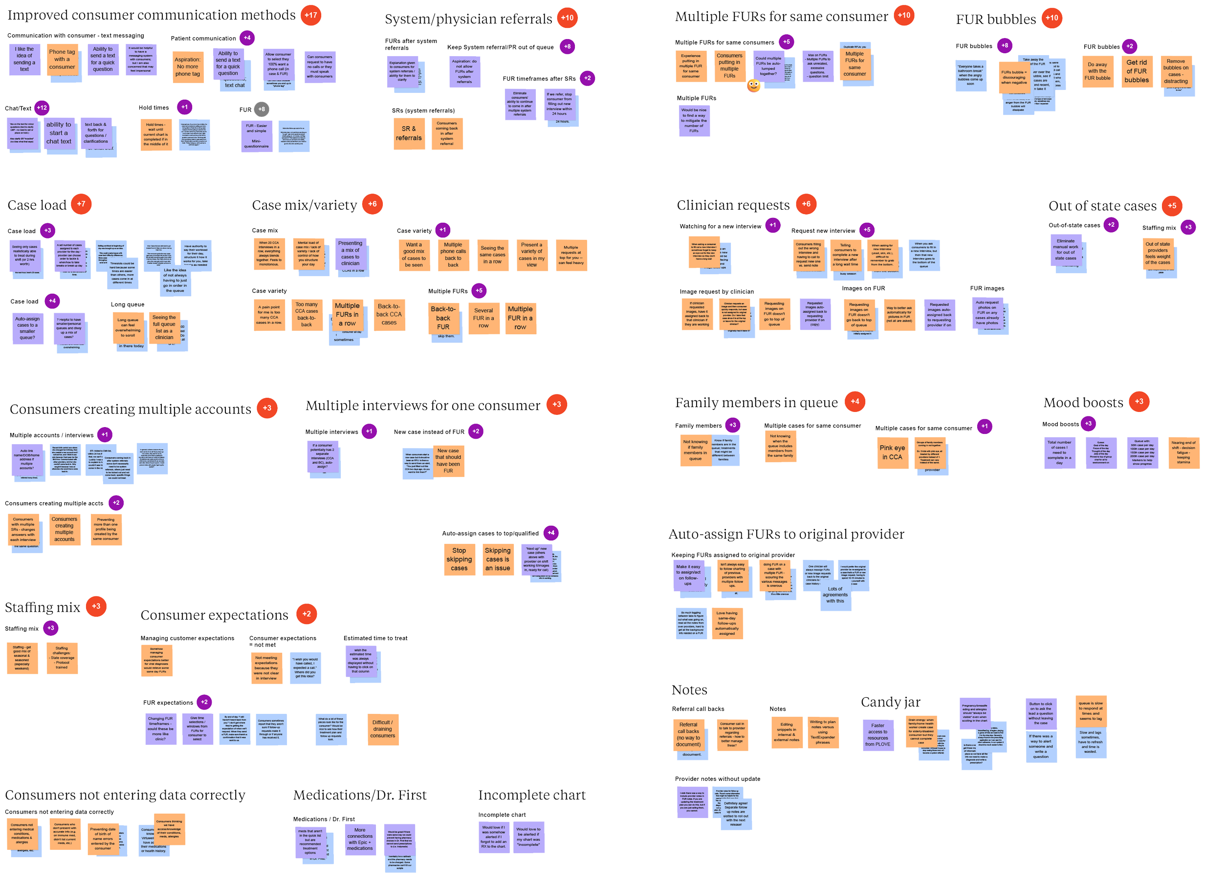
A few themes emerged as the biggest opportunities:

In order to justify the investment of this work to the business, we paired user insights with data.
Clinicians are keeping up with their daily workload, but the number of new cases coming in matches the number they complete each day. This means they start their shift with a queue that feels just as full as the day before and finish the day with it still feeling just as busy.

When studying the empathy mapping results of how clinicians think, feel, and do their work on any given day, a trend emerged: Goal-setting was a clear motivator, as velocity increased when getting closer to the end of a shift. Finishing the cases with estimated treatment times of that same day created a sense of achievement. When the queue list felt overwhelming, team leads would sometimes create themes of cases to complete within a certain time period, such as, “Complete only cases for warts for the next hour.”
To analyze the value that goal-setting could create, we leaned on the success of last year’s newest feature, the Care Dashboard, which exists on its own webpage. In this dashboard, clinicians could see their velocity and positive feedback from patients. Adding this dashboard resulted in an efficiency increase of 1.11 events per clinician per hour and 0.69 billed cases per hour. We believed that if we replicated the Care Dashboard’s positive psychology tactics of achievements & goal-setting directly in the queue, we could see similar improvements.


Confident that the improvements we pitched would help Wellvia's business move forward, the UX designer, product owner, and I brainstormed 5 possible features to add that directly addressed clinicians' needs. Guided by real user insight, and cognizant of technical feasibility, we asked ourselves:
To test these concepts, we set up 5 user feedback sessions with some of the same clinicians plus consistent questions which were all trying to gauge usefulness and desirability.
The largest visual change that clinicians noticed right away was a UI reskin. The queue in its present state was very cluttered-feeling, with a ton of colors and tightly-stacked text. Just giving the UI room to breathe could significantly reduce cognitive load.

While clinicians were overall excited about the UI redesign, it ultimately became too much of a technical feat. It would require a new design system and a heavy frontend lift, both things that we could not hit by our October deadline. Ultimately, it was removed from our MVP.

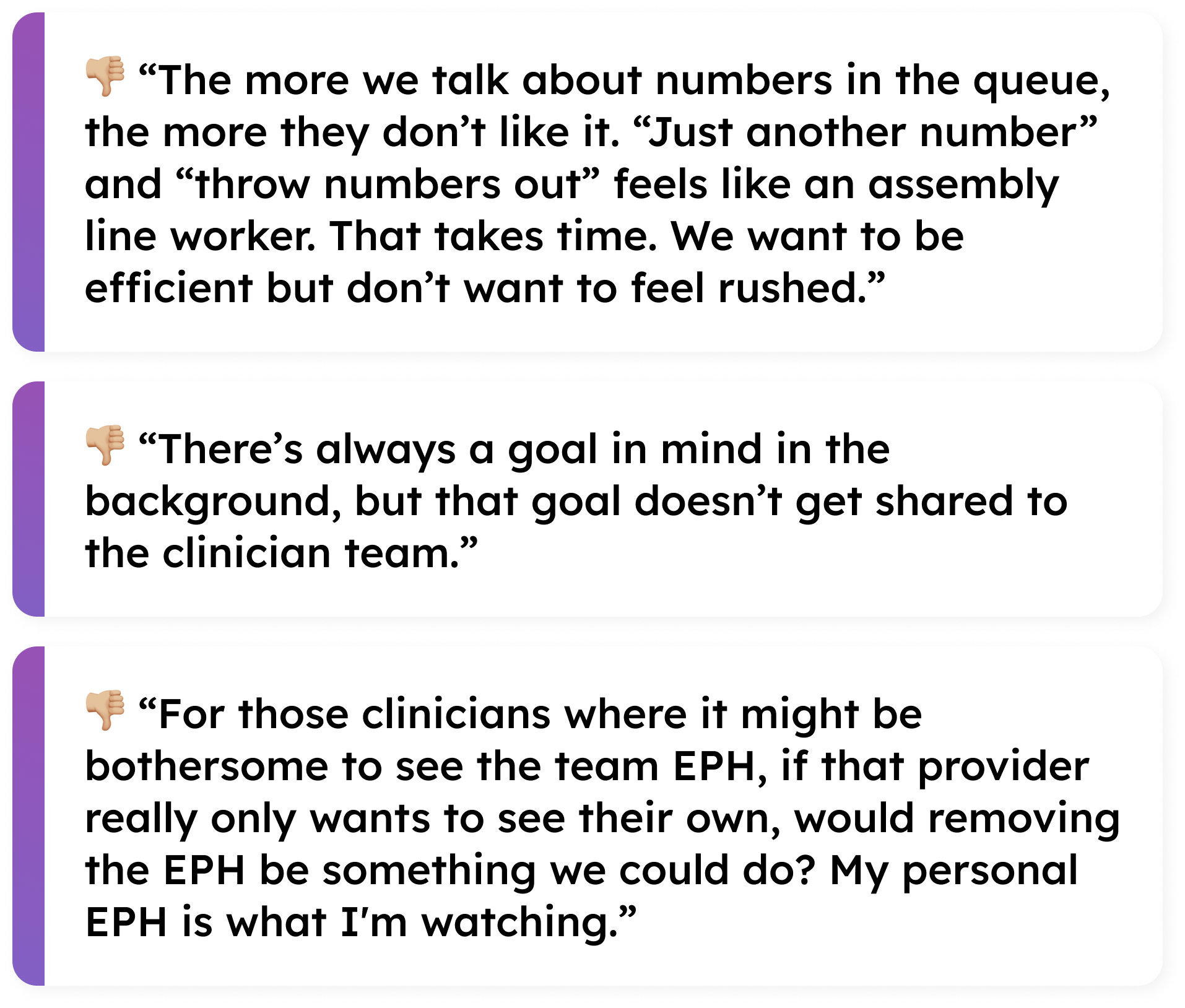
Last year, a Clinician Dashboard was added to the app, giving clinicians visibility into the metrics that were evaluated in their annual performance. It also allowed users to compare how they were doing compared to their peers. That concept was extended here: Metrics could be indicated at the bottom of the queue to keep them top-of-mind.
While we thought this idea would boost team collaboration, it actually did the opposite and took humanity out of the work.
Along with using the queue, we also heard that clinicians used Microsoft Teams on the side to chat with one another, pump each other up, and celebrate accomplishments, especially when queue work got endless and arduous. We wanted a way to mimic that directly in the Provider app so there was less of a need to deviate to another platform, and so that the Experience team didn't feel the need to monitor the queue progress as heavily.
While we received positive sentiment around the concept, there were many varied opinions on how these could be best utilized. Ultimately, discovery was too heavy for the tight timeline we had, and couldn't be completed by release.

Knowing that the long queue felt very overwhelming during busy season, we explored a way of truncating the "Eligible" list into smaller groups, which appeared on multiple pages that could be tabbed through. This would still keep the queue team-focused while visually breaking it up.
These smaller groups would dwindle down as the team worked on cases before the next group populated, creating a feeling of progress being made.

While clinicians were supposed to be doing a "first in, first out" approach and working the queue from the top-down, there were still scenarios where the entire "Eligible" list needed to be quickly scanned. This idea made it more difficult to achieve those needs, so we had to nix it.

With the current "first in, first out" approach, there was not currently a lot of flexibility in how clinicians structure their day, or a way to even know which cases would be coming for you next.
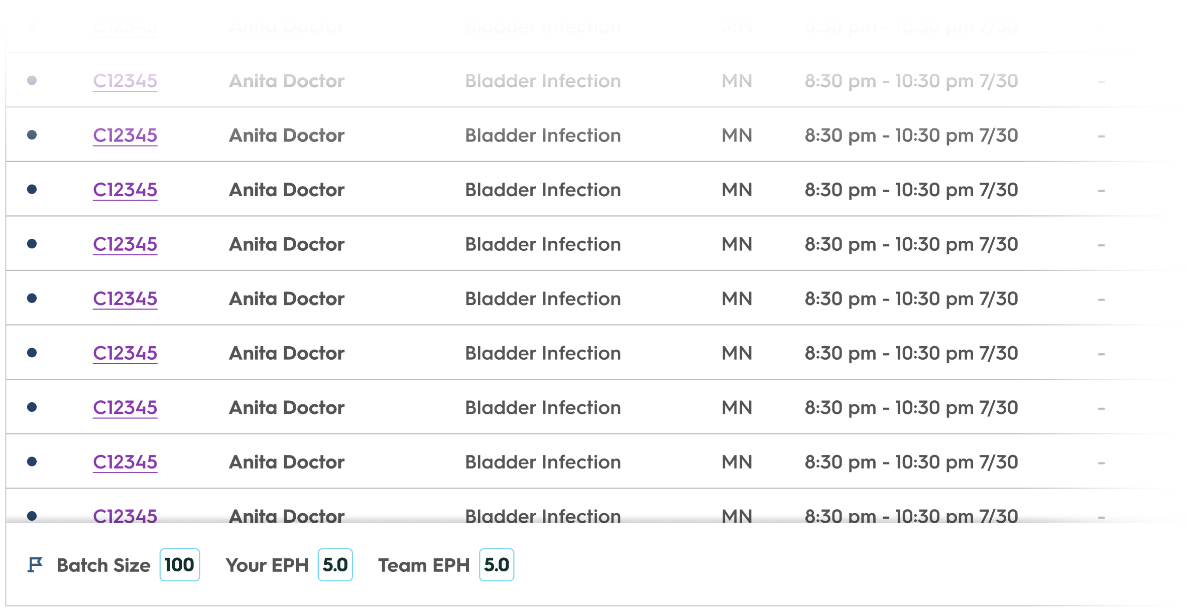
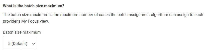
We added new tab, or working view, in the queue, which we initially called "My Cases" and later renamed to "My Focus". "My Focus" displayed cases in a truncated "batch" and cases were only assigned to that clinician based on a round-robin distribution of cases and filters previously applied (i.e. cases based on state licensing and specialties applicable to that clinician). Clinicians could complete the cases given to them in any order they chose; in our testing scenarios, we used 5 cases in a batch to resonate with the 5.5 cases/hour efficiency goal.

This idea of a "batch" gave clinicians ownership in their workload and was a resounding success.

“I just want to say thank you for taking all our recommendations and concepts that we've discussed and running with it. I feel like this is a pretty fast turnaround.”
– Clinician user testing participant
We presented these concepts and the user feedback to stakeholders to get the green light on adding them to our product roadmap. While the product team made strong recommendations based on user feedback, ultimately, the final decision came down to what our stakeholders were comfortable with.
As we raced towards our October 31 deadline, the acknowledgement of this being a fundamental shift in the way clinicians treated cases was causing anxiety for stakeholders. As we all knew, busy season could not risk technical outages or slowdowns.
This became a major blocker in our ability to move forward: We swirled constantly on the same ideas over and over, decisions were unable to be made, and we risked not meeting our deadline. There needed to be a radical shift in how we approached this work if we were to deliver our promised business value by the end of the year.

Stakeholder buy-in was not going to be achieved via multiple rounds of virtual meetings. Instead, we asked all of our stakeholders to set aside 3 hours on an afternoon, come into the office, and talk & whiteboard face-to-face. It was radically productive and a wonderful example of why I love coming into the office.

Our adaptable developers came up with the idea of individual feature flags. If, for any reason at all, we had a major technical outage relating to these new features that prevented clinicians from treating cases and generating revenue, we could pull it all back.
With a few flags that did not require a release, we could snap the queue immediately back to its previous version and clinicians could go back to treating cases as they had done for 15 years.
To meet our promised launch deadline and reduce the potential for disruption, we leaned on user feedback to ship the smallest product increment with the greatest value to our clinicians.
My Focus would display a list of 5 cases that were uniquely assigned to the clinician, called a "batch". These 5 cases were the first 5 from the top of the queue list which the clinician was licensed to treat.
As the clinician worked their list of 5, it would reduce until all were completed. Then they had the ability to add their next batch when they were ready.

While a batch size of 5 correlated to the efficiency goal, it might not always be the best number to use. Operations and Experience users could adjust this value to any number they thought was appropriate.
After all that rush towards our deadline, and all the hard work and collaboration into finding the right user-centered solutions to also drive business revenue, the outcomes exceeded our expectations in every way.

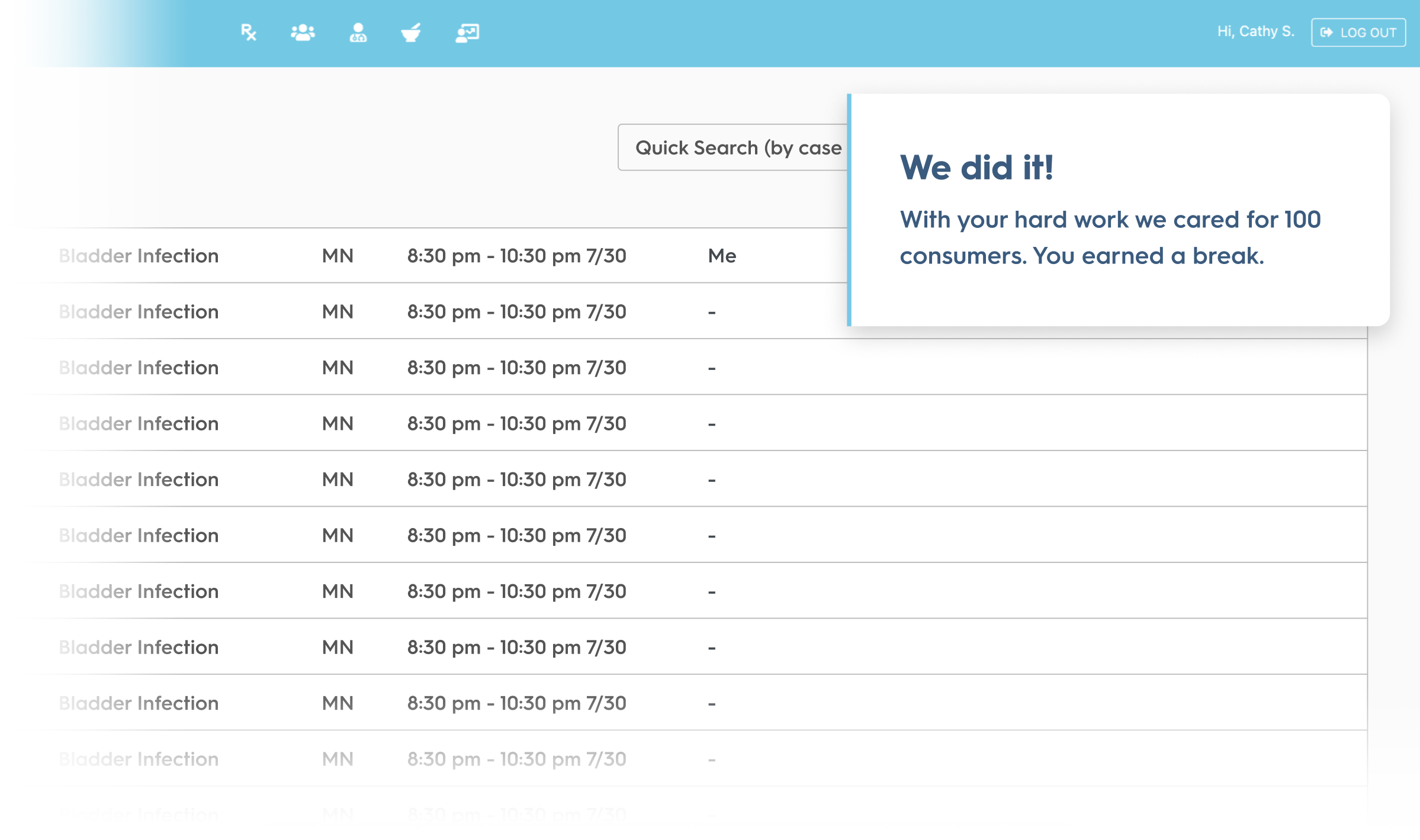
For the months proceeding the release of the "My Focus" queue, we had 3 days with an EPH over 7. This is a rate that has never been seen before in the history of Wellvia!

Because clinicians were completing more events each hour, they were also able to increase their rate of treated cases, generating greater revenue for the business.

Because Wellvia's business model does rely on seasonality (busy vs. slow seasons), month-over-month increases were sometimes just due to an increase in case volume. To further solidify our success, we made sure to compare that year's busy season metrics to previous years.

Made in the Midwest. © 2024 Josie Romano – All rights reserved.